Little Greene’s new colour cards have been unveiled!
Designed to make choosing colours a pleasure and intuitive for the user, Little Greene’s two new colour cards bring together the best of its capsule collections, showcasing 196 Little Greene colours in a new format, presented together, providing customers with a refined and refreshed ‘Colours of England’ collection alongside an expanded range of graduated shades in the new ‘Colour Scales’ offering.
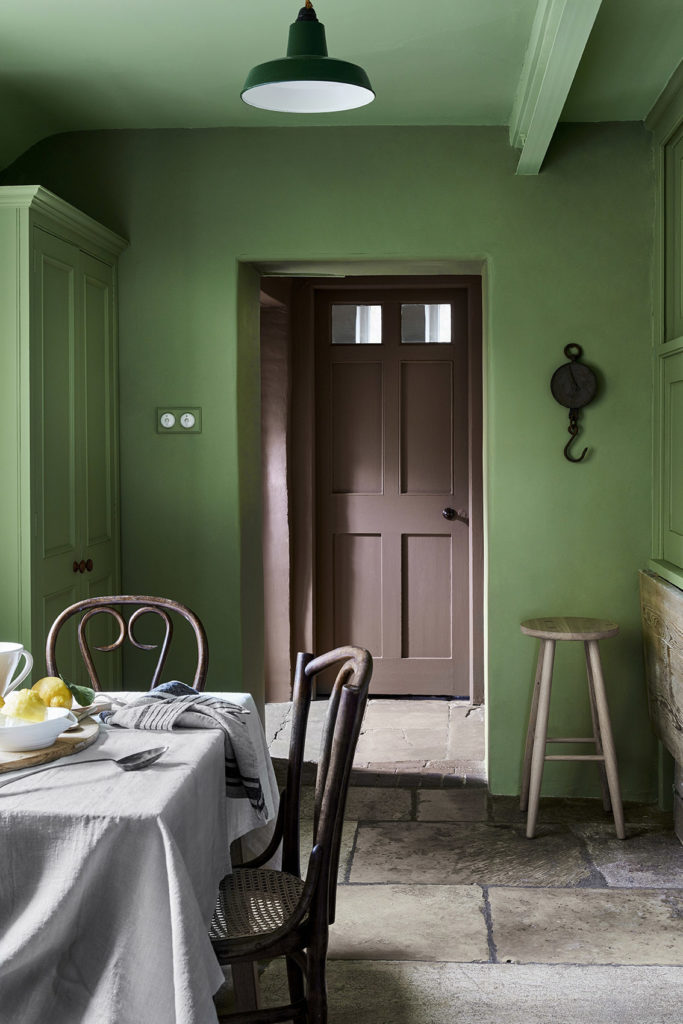
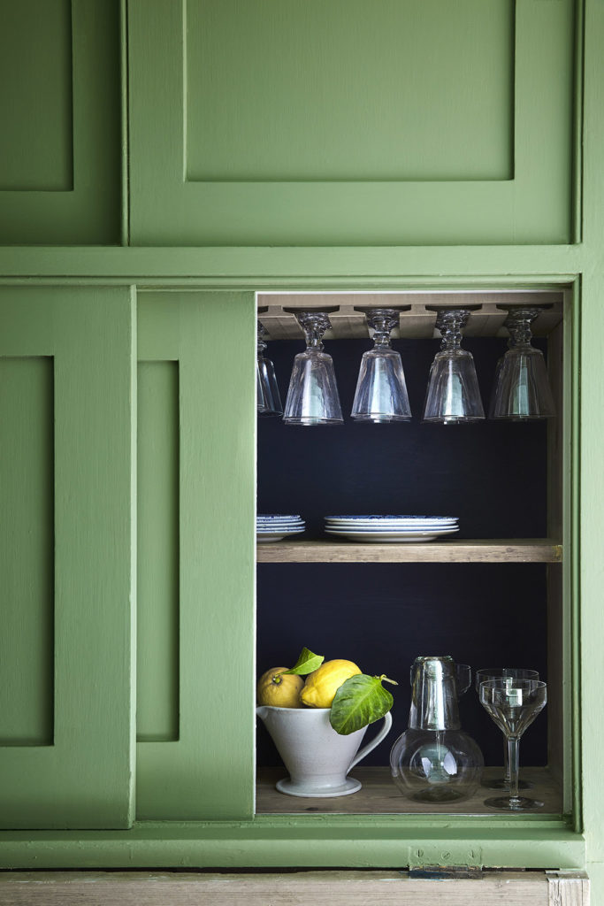
With confidence in colour central to the Little Greene ethos, the new cards span over 300 years of historic interior design and include many authentic 18th, 19th and 20th century shades. These historic colours are presented alongside a carefully adjusted palette of contemporary shades, embracing modern interior design aesthetics and current decorating trends
The new ‘Colours of England’ card has been updated to meet the growing desire for classic, timeless colours that are both simple to choose and a joy to live with. The collection includes many significant shades from all over the British Isles that have contributed to the internationally renowned style of ‘English Interior Design’.
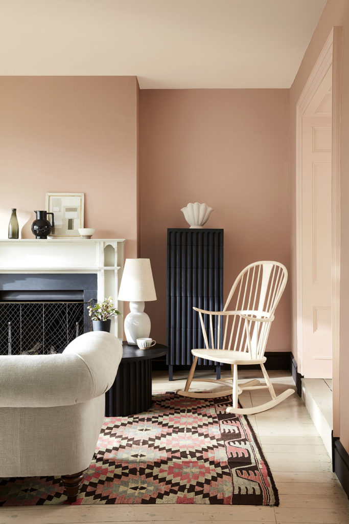
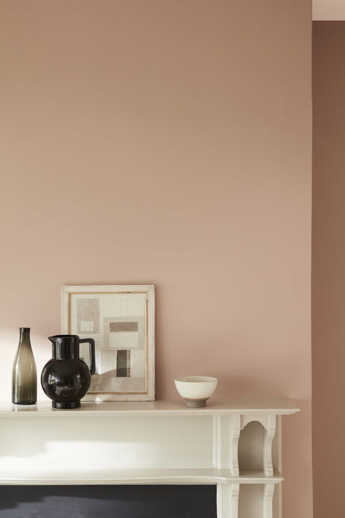
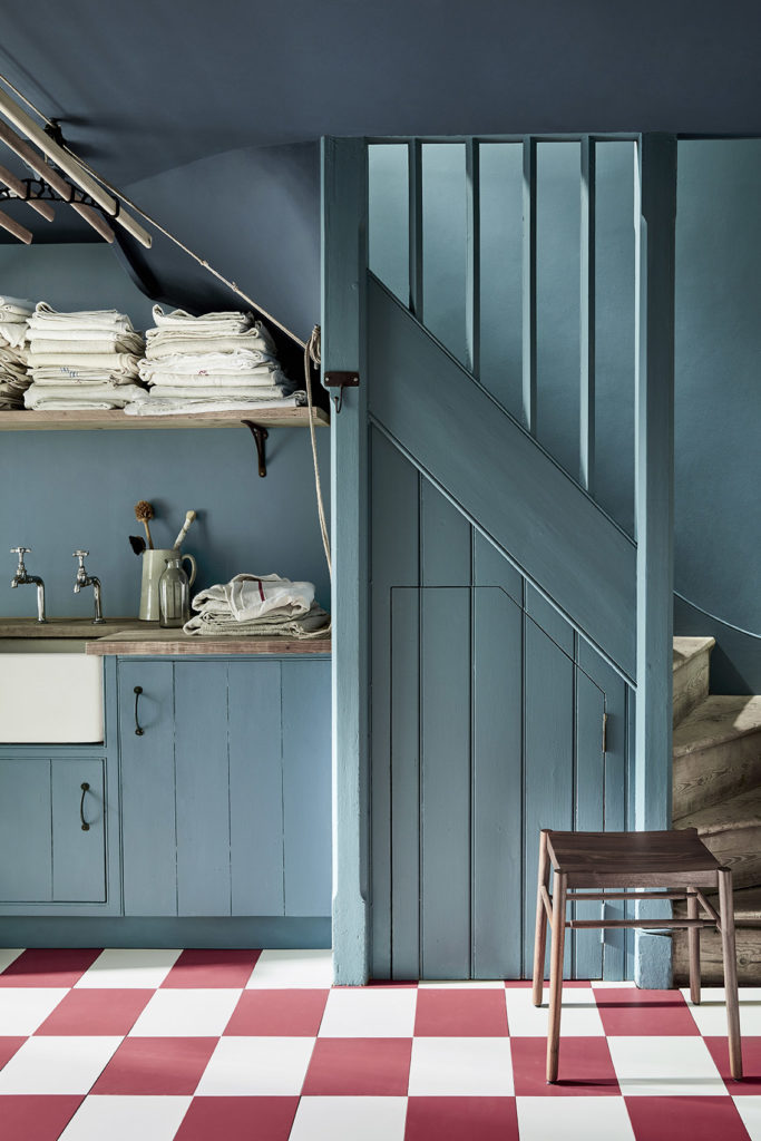
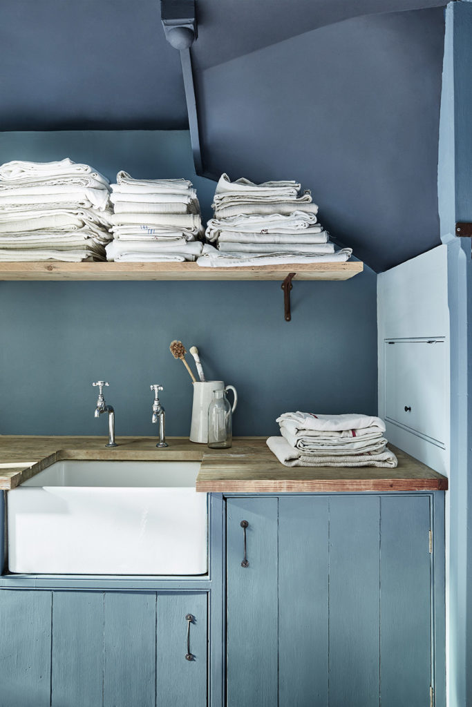
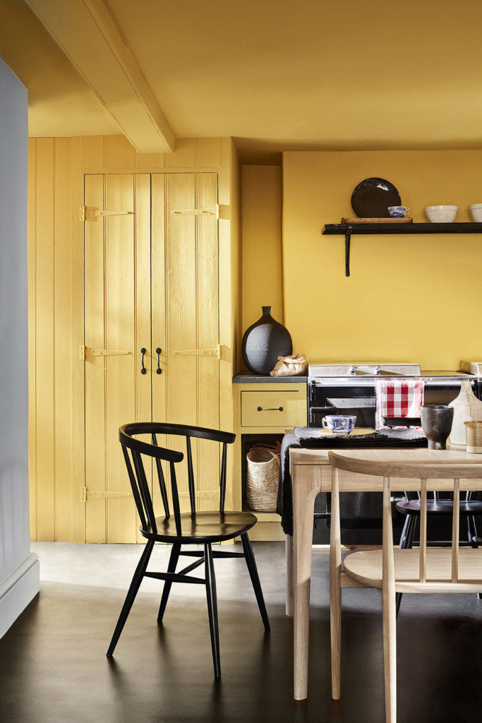
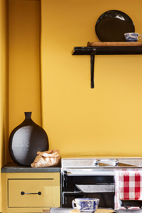
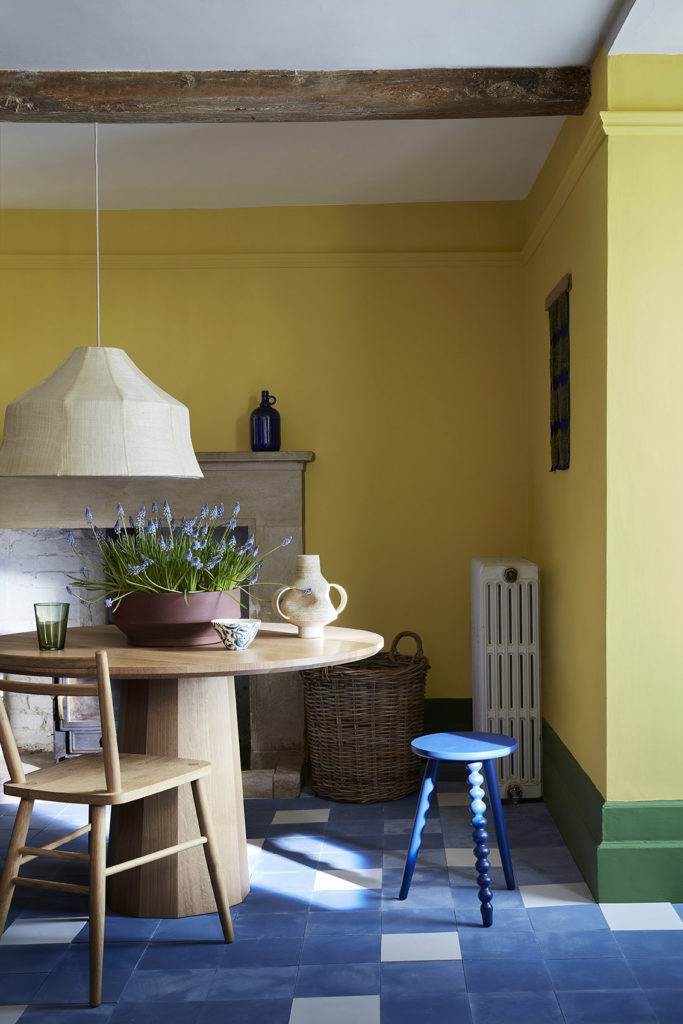
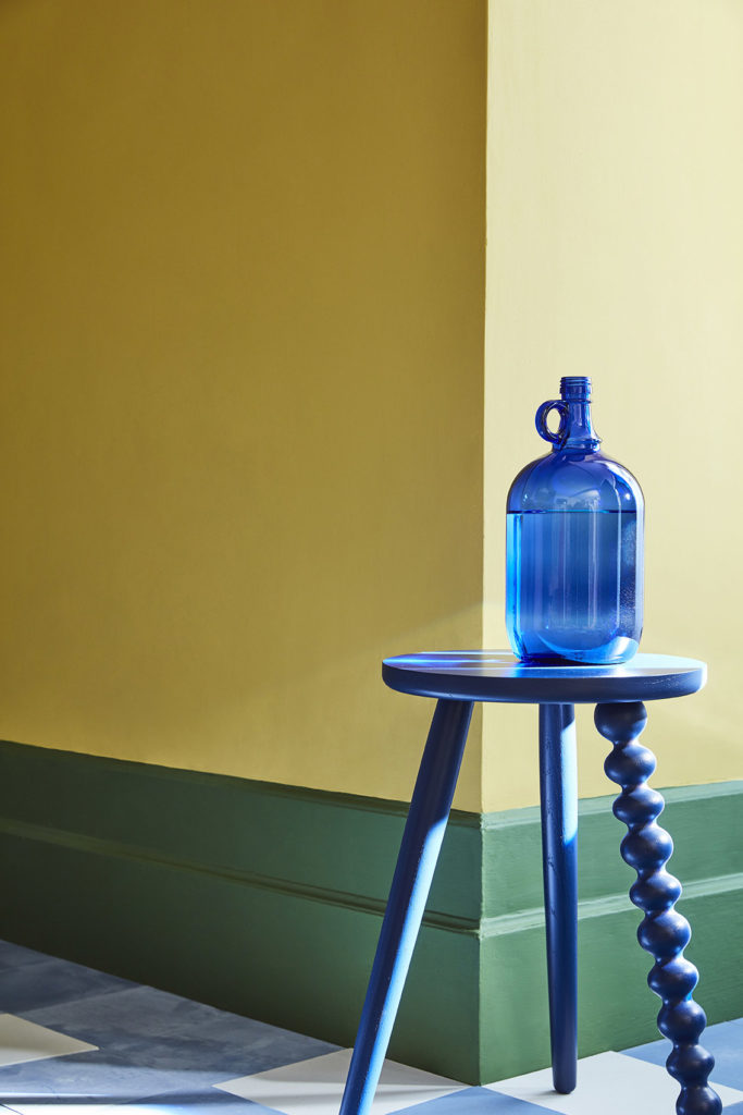
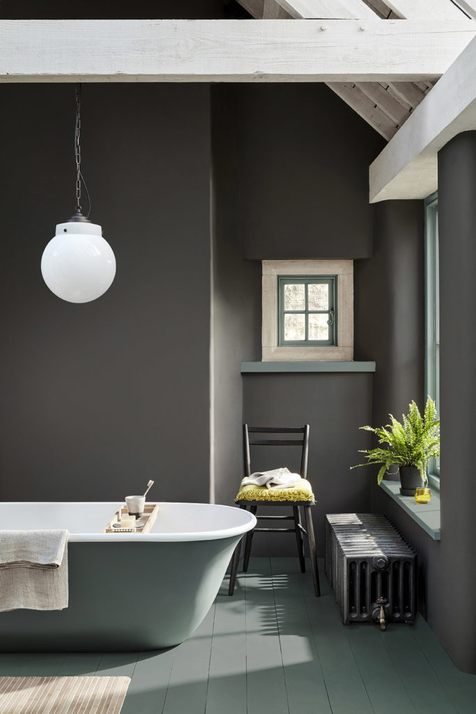
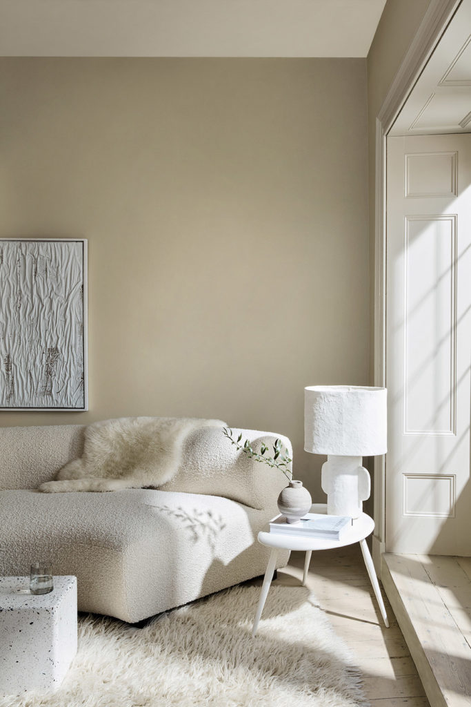
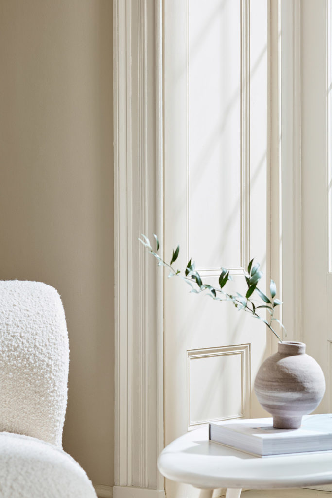
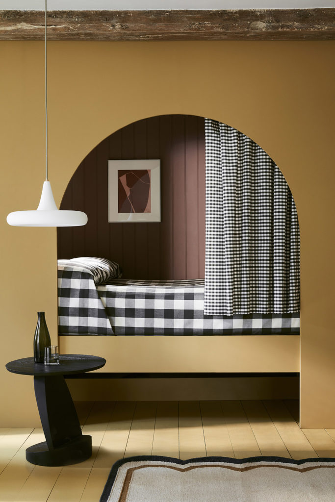
Ruth Mottershead, Marketing Director comments, “Alongside the cherished Little Greene signature colour palette, it is wonderful to be able to introduce new colours that celebrate the desire for warmth and joy such as ‘Indian Yellow’ named after the traditional oil pigment used by fine artists, ‘Bassoon’ with its deep-ochre undertone, and ‘Giallo’, an uncompromising, yet very easy-to-use, burst of golden sunshine. These bold and charming yellows illustrate our desire to return to warmth without regressing to cream. The punchy new yellows are accompanied by a host of new colours that include gentle powdery pink ‘Masquerade’, rich and charismatic charcoal grey ‘Vulcan’, the beautiful and inviting new mid-strength blue ‘Etruria’ and ‘Silent White’- the answer to the everlasting quest for the perfectly balanced, calming and elegant neutral-warm white”.
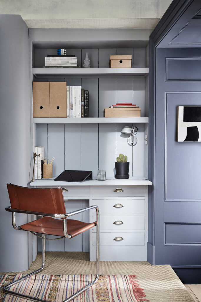
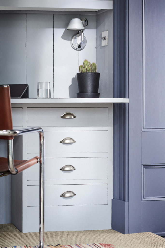
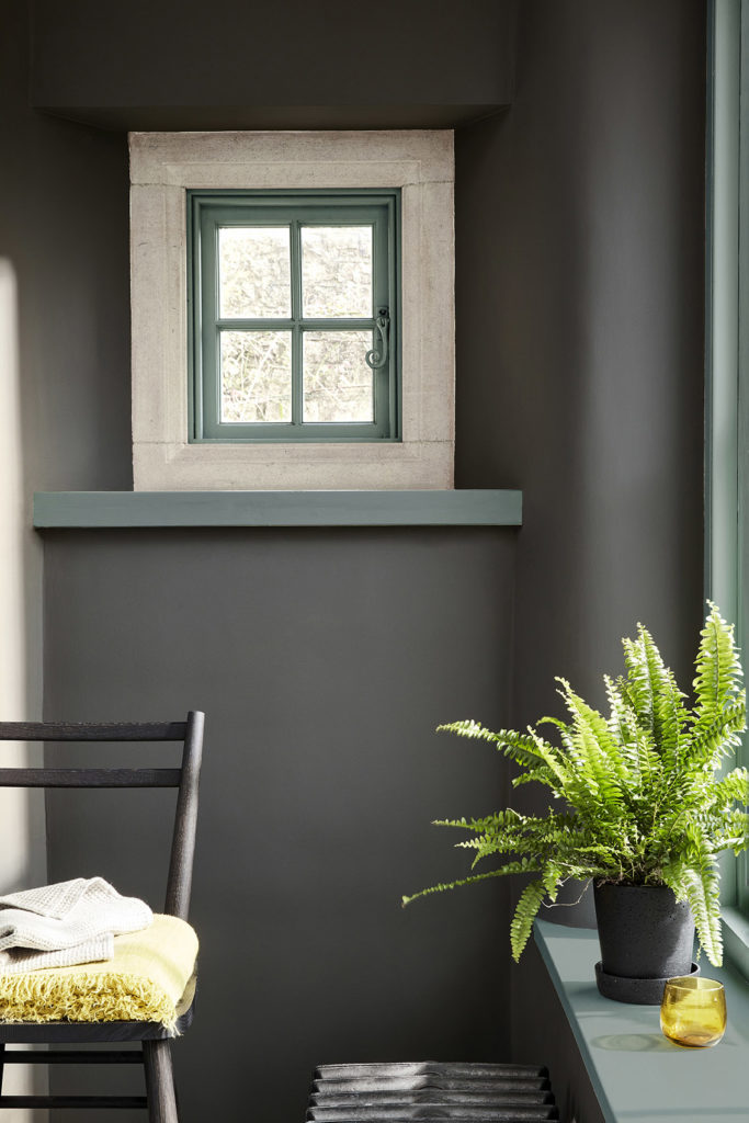
The extended ‘Colour Scales’ colour card, offering a further eight families of diluted iconic Little Greene colours, and incorporating the ‘Stone’ and ‘Grey’ capsule collections, is a response to the increasing desire for easy and simple-to-scheme colours that create harmonious and monochromatic backdrops to decoration. The new ‘Colour Scales’ card also includes deeper colours alongside the ever-popular diluted shades, as useful identifiers for the undertone of each colour family.
The card has been designed for ease of use, each colour is one of a graduated family, grouped in columns according to undertone. Shades within the same column can be used together for tonal coordination, or across columns to create a balanced contrast.
Ruth Mottershead continues: “The neutral trend for 2021 continues subtly away from cold greys and traditional country creams, towards neutral stone tones, complex greys and nature’s favourite; green. By providing these soft tonal colours in families we can offer a subtle spectral range that consumers can combine with confidence. The lightest four shades work beautifully to add discreet depth to a room, softly defining characterful architectural features, or reducing the contrast of walls and ceilings which might be subjected to different light levels. The deeper shades can be used to complete a coordinated, harmonious scheme that, whilst monochromatic in hue, makes a strong statement with an expansive depth of colour.”
40 of the most popular shades appear on both cards, providing customers the opportunity to see these exceptional shades in different environments, each illustrating how the colours work in a coordinating and harmonious, or dynamic and diverse way.
Contact presse :
Bureau 110
+33 (0) 1 41 06 51 00
contact@bureau110.com
Little Greene Paris Showroom
21 Rue Bonaparte – 75006 PARIS
+33 1 42 73 60 81

